|
|
Post by Wyvern on Jul 7, 2008 20:15:34 GMT
Well, we have a thread for dream cars, but what about the other end of the scale? Cars that are bizarre (and not in a good way), repulsive or just plain rubbish deserve to go somewhere. If you spot a car that presses all the wrong buttons, this is the place to park it. Just remember, there's no accounting for taste  Here are a few of my "favourites"... 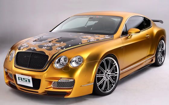 The ASI Tetsu GTR, a Japanese-modded Bentley Continental GT. East and West collide, quite literally, to produce this interesting piece. Piece of what, I'm not sure, but it is at least unique... thank goodness. 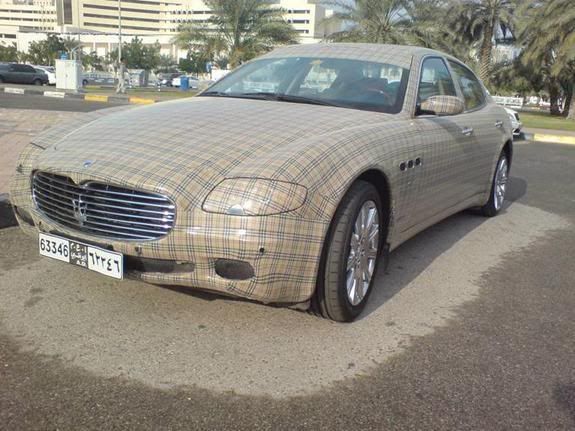 The Maserati Quattroporte is such a beautiful car. Usually. Unfortunately, this one seems to have been commandeered by chavs  Wrong on so many levels... 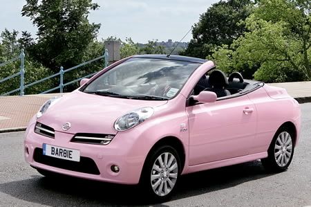 It doesn't have to be a Barbie-pink Nissan Micra C+C. I hate all Nissan Micras equally. I can't explain why, but they trigger a reaction somewhere deep inside my subconscious. Probably because my dad keeps saying I should buy one... no wonder I have no motivation to take my driving test! 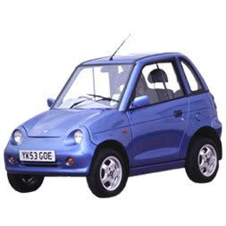 The one thing that I would buy a Micra in preference to. There is no excuse for the G-Wiz. Electric cars don't have to be slow, short-range or ugly and the Tesla Roadster proves this. This isn't even a proper car - and it's bloody expensive for what it is, too  |
|
|
|
Post by inky on Jul 7, 2008 21:31:46 GMT
Got to agree with all of them wy. They are truely shocking  |
|
Deleted
Deleted Member
Posts: 0
|
Post by Deleted on Jul 7, 2008 22:25:42 GMT
My god yes!
I feel I should put Hondas in here too.
|
|
|
|
Post by adco on Jul 8, 2008 3:17:01 GMT
There's lots of little Hondas or Mitsubishis here that people have customized themselves. Some are pretty pitiful. I will take pictures!
|
|
helenanne
Smutty Mayhemer
  'The driver's window, appearing grey and opaque in the low autumnal sun, slid down like mercury...'
Posts: 159
|
Post by helenanne on Jul 8, 2008 18:48:45 GMT
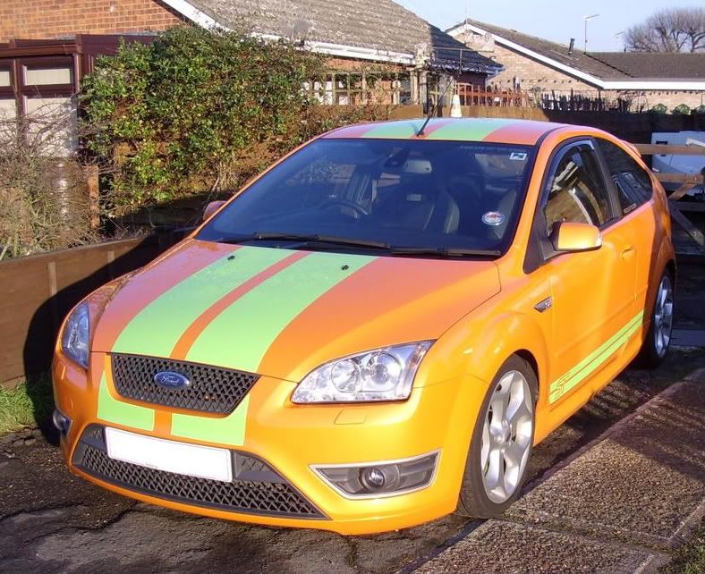 Heaven or Hell?  ? |
|
|
|
Post by xjsarah on Jul 8, 2008 18:53:59 GMT
Bloody hell, it's been Tangoed!!  ;D |
|
|
|
Post by lew on Jul 8, 2008 18:56:06 GMT
|
|
|
|
Post by lymaze on Jul 8, 2008 18:59:29 GMT
That's just wrong.  |
|
|
|
Post by inky on Jul 8, 2008 19:00:32 GMT
The Ford ASBO ST looks a lot better in black or Electric Blue. That one has definitely been Tango'd  |
|
|
|
Post by Wyvern on Jul 8, 2008 22:34:35 GMT
I actually kind-of like the ASBO in orange, but definitely not with those stripes... it's horrid.
In fact, there's only one car that really gets away with that colour, and it's in the car spotting thread ;D
|
|
Deleted
Deleted Member
Posts: 0
|
Post by Deleted on Jul 8, 2008 22:59:02 GMT
 Heaven or Hell?  ? I've seen the orange paint job in the metal work and it's quite stunning and wrong at the same time that it can get away with being the orange. |
|
|
|
Post by Wyvern on Jul 14, 2008 17:49:15 GMT
I know I put this photo in the 'car spotting' thread, but as a representative example of another of my pet motoring peeves, it can go here too. I hereby consign chavved-up limos to Hell's Garage! 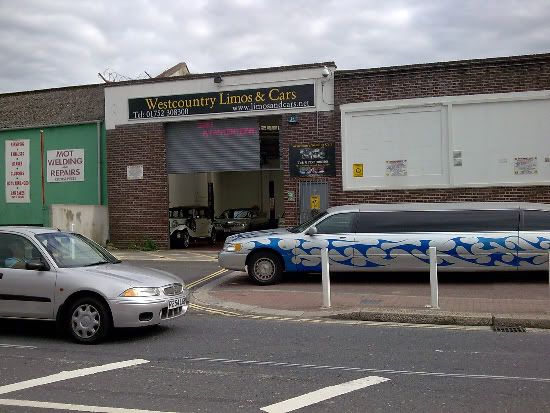 I have nothing against limos in general. I just hate when they're given a tacky paint job and used to ferry around groups of drunken yobs on a weekend. There is nothing at all refined or classy about sticking your bare arse out of the window of a car, whether it is a badly modded Citroen or a 700-foot-long Caddy. 'Nuff said. |
|
|
|
Post by Vixen on Jul 16, 2008 16:31:37 GMT
I like the Bentley in the first post and I like the Ford too 
|
|
|
|
Post by Wyvern on Aug 11, 2008 1:31:13 GMT
I've always said that any car would look good in the Gulf racing colours. It particularly suits Aston Martins and I've seen an old GT40 given the Gulf treatment and it was truly stunning. But in the best tradition of Top Gear, I went on the Internet and I found this... 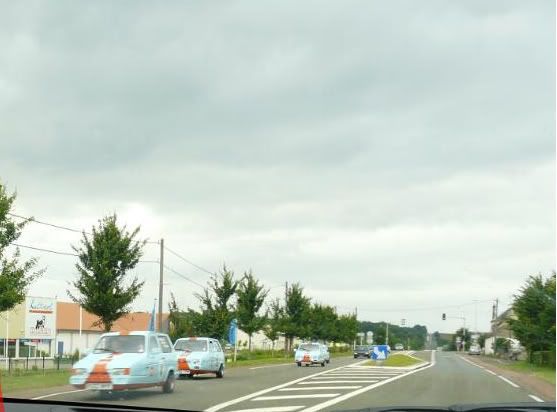 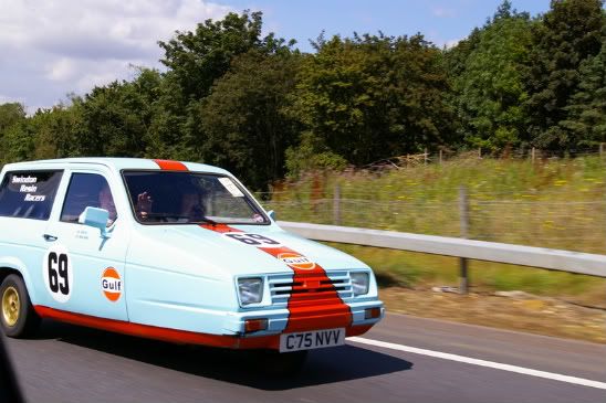 Both hideous and utterly brilliant at the same time. Apparently, there are six of them but I haven't been able to track down a photo of all six in action. Hats off to Swindon Resin Racers for having such a fabulous sense of humour  . Part of me really didn't want to park their Gulf-liveried Reliants here, but you can't call them car porn and they certainly aren't my dream car... EDIT: Here they are, 5 of the (alleged) 6 cars on their way to/from the Le Mans 24hr. Fabulous! 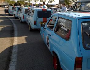 |
|
|
|
Post by Puss on Aug 11, 2008 1:42:05 GMT
LOL! Noice.
|
|
|
|
Post by Puss on Aug 11, 2008 1:44:15 GMT
As far as I am concerned this is the worst car ever... I learned to drive in it.   The Mitsubishi Nimbus. No style, no performance, no redeeming features. |
|
|
|
Post by Wyvern on Aug 11, 2008 1:52:07 GMT
*shudder*
|
|
|
|
Post by Puss on Aug 11, 2008 1:54:22 GMT
 Peugeot 405. My DH had one of these about 10 years ago, all in all, not a bad vehicle. Except for the fact it leaked like sieve and all the electricals were screwed ie. the idicator only worked when you had your foor on the brake pedal. One morning we got up after a night of heavy rain, the car was parked on a slope and as we revesed onto the flat, a tidal wave of water swept from back to front footwells, under the carpet! So yes, this one is a definite for Hell's Garage. Also it used to break down on the harbour bridge a lot.  |
|
|
|
Post by Wyvern on Aug 12, 2008 16:26:46 GMT
Mmm... yes, that one is definitely worthy of the Garage, Puss! This, OTOH, isn't, but if anyone would like to see a really stunning example of a Gulf-liveried car, check out the Aston Martin Racing Gulf DBR9. Though admittedly it does look like a loach wearing lipstick from some angles. Hey, too much perfection would be boring  |
|
|
|
Post by maureen on Aug 12, 2008 18:36:56 GMT
One of the new guys at work was talking about his Rover and I giggled a bit. I didn't mean it to be mean, but I immediately thought of Rich (from Montana) and his country song about the Rover. He's such a funny guy.
|
|
|
|
Post by Wyvern on Aug 12, 2008 18:43:33 GMT
Rich Hall's Rover song is one of my all-time favourite SIARPC moments ;D But talking of Rovers, another one for the Garage...  The Tata Indica Cityrover. Mmm... |
|
|
|
Post by maureen on Aug 12, 2008 19:36:10 GMT
That almost looks like a Pontiac symbol on the front. My mother had one when I was about nine and the clutch and gears died a slow painful death.
|
|
|
|
Post by Wyvern on Aug 12, 2008 19:55:13 GMT
  You know, I can sort-of see it. And they both feature historical references; the Rover logo is based on a Viking longboat (this may have been more obvious in the pre-2003 version, which featured a less stylised version of the design, complete with fearsome figurehead), while the Pontiac logo is inspired by Native American arrowheads, with the name linking to Chief Pontiac of th Odaawaa (who led an unsuccessful attempt to take Fort Detroit). |
|
|
|
Post by maureen on Aug 12, 2008 20:18:45 GMT
That is alot of great history linked to these two cars. Thanks for the great information.  It kind of fits the way these two car companies create the vehicles that they create. LOL. |
|
|
|
Post by Puss on Aug 13, 2008 1:27:17 GMT
Viking longboat, eh? Had you not told me that I would have assumed it was something quite differnt... Rovers are not very common here.  |
|
|
|
Post by Wyvern on Aug 13, 2008 7:24:44 GMT
Actually, although I suppose I just see a longboat because I'm used to it and I know where the design comes from, now you mention it, it does look rather like, er, something else entirely - and given what the cars are like, something not too inappropriate, at that  |
|
|
|
Post by wildcathammondette on Aug 13, 2008 7:56:47 GMT
one word to complete this all: YIKES!!
|
|
Deleted
Deleted Member
Posts: 0
|
Post by Deleted on Aug 17, 2008 22:57:44 GMT
Ford StreetKa or the tinopened Ka and the matching dress! But this pink is a bit too much. Here until the new design comes out and looks much better.  |
|
|
|
Post by Wyvern on Aug 17, 2008 23:15:59 GMT
You beat me to it! I saw that very photo and just thought "ARRRGGGGHHHH!"
Still, at least the dress isn't topless too...
I've actually worked out what the problem is with this car, I think. It's because the Ka, in its earlier incarnation, has a very saggy arse. It is just about balanced out by the curve of the roof in the regular version, but with the top removed and the design flattened out (see the "Winter Edition" to see how noticeable this flattening effect is, it looks like the offspring of an Audi TT and a VW Beetle), it looks like the back end is being dragged downwards. It's unfortunate really, because it was a nice idea in theory.
I do wonder if they'll do a "Street" version of the new Ka when it launches later this year. Mind you, the new version seems to look like a baby Focus based on the few pics I've seen so far.
|
|
|
|
Post by xjsarah on Aug 17, 2008 23:21:53 GMT
Yikes!!  That's way too pink for my liking! Pink is a very nice colour in its own right, but not on cars.  |
|